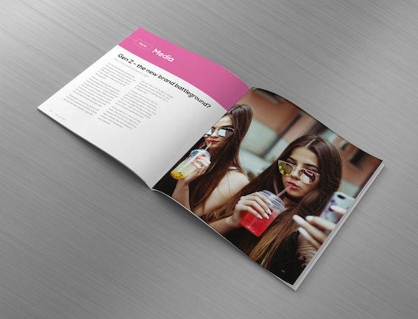
When you are looking to market your product or service, you can achieve much with a highly targeted, well-designed leaflet. They are relatively cheap to produce and can quickly reach a broad audience. However, to be successful, a leaflet should include some essential ingredients.
Here we explore the 10 things every leaflet should include.
1. Brand Colours and Logo.
Having spent a great deal of time and money branding your organisation, it is then essential to ensure that your colours and your logo appear on everything you produce. Whatever your marketing strategy, it should all relate the same colour scheme and that all-important stamp of recognition for your organisation. Virgin is an excellent example of this. No matter if it is trains or media, the colour scheme is red, and the distinctive squiggle of the name is printed everywhere.
2. Be focused on your purpose.
Every leaflet you produce should serve a specific purpose. This purpose will be different each time; therefore, the content of your leaflet should be tailored to the specifics of this part of your marketing campaign. If you are producing leaflets with the same material, again and again, you bombard your audience with junk and cause your marketing campaign to stagnate. Another way of saying this is you will be wasting your money.
3. Be focused on your audience.
One of the critiques of a leaflet is that they are limited in their capacity for targeted marketing based on demographics. Generally, the most successful marketing is that which finds its way into the hands of your profiled customer, that specific group who would just love to buy from you. Although you cannot knock on the door of these people and hand them your leaflet, you can make sure that all your design choices are highly appealing to this specific group.
4. Then speak to them.
Once you have decided on your audience, you should then speak to them directly. It would be best if you avoided overly academic speech or using the geeky language of your specialism. Use friendly, professional language and make sure the pronouns used are “you” and “your”.
5. The impactful title.
Your leaflet will be distributed in a crowded field of other leaflets. How does the reader know that this leaflet is meant specifically for them and for their needs? Your title will make this completely clear in as few words as possible. The title will say what the leaflet is about, who it is for, and why it is appealing to this group – but in about four or five words maximum.
6. Give the necessary details.
Be clear on the detail that must be included for the leaflet to work and only include this detail in your design. You are limited for space and consumer attention. The reader is not going to commit to reading an essay. You need a massive amount of graphical appeal and only the most vital details.
7. Space is essential to good design.
Sometimes great design is defined by what is not included. The white space on a leaflet allows the vital detail to zing. A crowded, overly formatted leaflet will cause information overload, and the reader will discard your marketing before reading a word. Keep the writing to a minimum, use headings and subheadings well – and most importantly – clearly structure these within the space of the leaflet. The correct spacing is a little more than asking for the leaflet to be laid out well, though the two are often interlinked.
8. Useful imagery.
Your audience will pass at a million miles an hour. You need to stop them in their tracks with a message in your image. No intelligent written content will do this for you. Your images should support the feel of the leaflet, or the general approach you are taking. They should be fitting to the topic but also to the feel you are creating. If you want to be friendly or if you want to be formal and professional, your choice of design of the same picture would be completely different.
9. Be Persuasive.
Once you have the attention of the reader, make use of it! Do not squander this opportunity with weak content. You need a top-quality copywriter who can deliver your message with the power of persuasion.
10. The CTA.
Finally, and most crucially, make sure your final point tells the reader what to do now. You need a direct and unambiguous call to action. If we were to give you a CTA, we might suggest: contact a design company today to be rewarded with professional and affordable leaflet design.
from Young Upstarts http://bit.ly/2FlIvFS via website design phoenix


No comments:
Post a Comment